Nature's bias? Delhi's heat falls unevenly
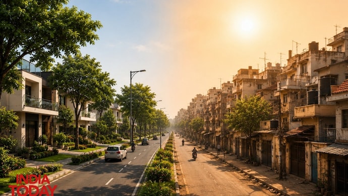
In Delhi, where you live may determine how much heat you endure. India Today's satellite analysis shows a heat penalty of up to 7°C between dense, lower-income neighbourhoods and greener, more affluent localities.


Delhi makes headlines in every season; only the crisis changes. Winter leaves the city shivering and choking as air pollution worsens while temperatures fall. The monsoon brings relief from the heat, only for familiar scenes of waterlogging and disruption to return. Summer, meanwhile, is becoming increasingly unforgiving, with temperatures climbing to harder extremes.
A city of seasonal contrasts, Delhi’s challenges merely shift form through the year. Yet beneath this familiar struggle lies another reality: the city’s heat has its own geography.
India Today’s Open Source Intelligence (OSINT) team’s analysis suggests that different localities in Delhi experience rising temperatures unevenly, with residents of denser, relatively lower-income and less-affluent neighbourhoods often facing warmer surface conditions than those living in nearby areas that are greener, better planned, and considered posh.
Take Southeast Delhi, for instance. Analysis of Land Surface Temperature (LST) derived from NASA/USGS Landsat 8 and 9 satellite imagery between April 1 and May 16 this year reveals a clear heat divide between neighbouring localities. Sarita Vihar, a relatively greener and more planned neighbourhood, recorded an average LST of around 39°C. Yet in denser pockets around Madanpur and Shaheen Bagh, surface temperatures rose sharply, touching nearly 46°C. In effect, a journey of just a few kilometres can expose residents to a temperature difference of almost 7°C.
That stark contrast points to a story behind Delhi’s rising temperatures: why does heat exposure change so sharply across such short distances?
The answer, however, can be inferred from LST and the factors that influence it. Unlike atmospheric temperature, which measures the air around us and is what weather apps typically report, LST captures how hot the ground or built surface actually becomes. Yet these variations are not driven by geography alone. They are closely tied to the city’s built environment and unequal urban conditions.
To examine Delhi’s heat divide, India Today analysed LST using NASA/USGS Landsat 8 and 9 satellite data between April 1 and May 16, removing cloud interference and averaging readings. Separately, Sentinel-2 imagery processed in Google Earth Engine was used to map Delhi’s land use.
DELHI’S TEMPERATURE RISE IS NOT UNIFORM
NASA’s research on urban heat, along with a similar study by the World Resources Institute, suggests that where you live can quietly shape how much heat you endure. Neighbourhoods with greater tree cover, wider roads, and more open spaces tend to remain relatively cooler, as heat disperses more easily. In contrast, the study indicates denser settlements with tightly packed housing, limited greenery, extensive built surfaces, and restricted airflow often retain heat for longer, resulting in harsher surface conditions.
If you live in Vasant Kunj, one of Delhi’s posh neighbourhoods, the average LST during the period April 1 to May 16 was around 37°C. Move barely a few kilometres to Mahipalpur, a denser and less affluent, largely unorganised settlement, and conditions turn noticeably harsher. Here, the average satellite-derived land temperature rose to nearly 44°C during the same period.
Interestingly, these neighbourhoods lie only a few kilometres apart, yet experience very different heat realities. The satellite-based heat map suggests that Delhi’s summer is not felt equally. Instead, the city appears to break into smaller heat pockets.
In another part of Delhi, a similar contrast emerges between relatively affluent and less affluent areas. In South Delhi, Greater Kailash-1 appears as a cooler pocket on the heat map, recording an average LST of around 38°C during the same period. By contrast, Mundka in outer West Delhi, located nearly 30 kilometres away, registers significantly higher surface temperatures, with average LST touching close to 44°C.
This shows how consistently some planned neighbourhoods appear cooler, while other parts of the city repeatedly show up as warmer patches. It is visible enough to suggest that Delhi’s heat is not spreading randomly. Instead, it appears to follow the city’s urban form, revealing a summer landscape shaped as much by planning as by temperature itself.
LST imagery derived from Landsat 8/9 satellites and vegetation mapping based on Sentinel-2 land cover analysis further reinforces this divide, as an obvious spatial pattern is visible widely across Delhi. Areas with relatively higher green cover, particularly along the Yamuna floodplains and parts of South and East Delhi, consistently appear cooler on thermal maps. For instance, Mehrauli recorded an average surface temperature of around 34°C, while Siri Fort and Azad Nagar stood at roughly 36°C and 35°C, respectively. In contrast, denser and less vegetated pockets in West and Northwest Delhi emerge as clear heat hotspots, with Bawana touching nearly 48°C, Mubarakpur rising to 52°C, and Najafgarh and Dhansa hovering around 45°C during the same period.
The contrast points to a city where heat-retaining concrete has expanded far faster than natural cooling features. Crucially, this transformation has not unfolded evenly across Delhi, helping explain why some neighbourhoods are heating up more intensely than others
Delhi makes headlines in every season; only the crisis changes. Winter leaves the city shivering and choking as air pollution worsens while temperatures fall. The monsoon brings relief from the heat, only for familiar scenes of waterlogging and disruption to return. Summer, meanwhile, is becoming increasingly unforgiving, with temperatures climbing to harder extremes.
A city of seasonal contrasts, Delhi’s challenges merely shift form through the year. Yet beneath this familiar struggle lies another reality: the city’s heat has its own geography.
India Today’s Open Source Intelligence (OSINT) team’s analysis suggests that different localities in Delhi experience rising temperatures unevenly, with residents of denser, relatively lower-income and less-affluent neighbourhoods often facing warmer surface conditions than those living in nearby areas that are greener, better planned, and considered posh.
Take Southeast Delhi, for instance. Analysis of Land Surface Temperature (LST) derived from NASA/USGS Landsat 8 and 9 satellite imagery between April 1 and May 16 this year reveals a clear heat divide between neighbouring localities. Sarita Vihar, a relatively greener and more planned neighbourhood, recorded an average LST of around 39°C. Yet in denser pockets around Madanpur and Shaheen Bagh, surface temperatures rose sharply, touching nearly 46°C. In effect, a journey of just a few kilometres can expose residents to a temperature difference of almost 7°C.
That stark contrast points to a story behind Delhi’s rising temperatures: why does heat exposure change so sharply across such short distances?
The answer, however, can be inferred from LST and the factors that influence it. Unlike atmospheric temperature, which measures the air around us and is what weather apps typically report, LST captures how hot the ground or built surface actually becomes. Yet these variations are not driven by geography alone. They are closely tied to the city’s built environment and unequal urban conditions.
To examine Delhi’s heat divide, India Today analysed LST using NASA/USGS Landsat 8 and 9 satellite data between April 1 and May 16, removing cloud interference and averaging readings. Separately, Sentinel-2 imagery processed in Google Earth Engine was used to map Delhi’s land use.
DELHI’S TEMPERATURE RISE IS NOT UNIFORM
NASA’s research on urban heat, along with a similar study by the World Resources Institute, suggests that where you live can quietly shape how much heat you endure. Neighbourhoods with greater tree cover, wider roads, and more open spaces tend to remain relatively cooler, as heat disperses more easily. In contrast, the study indicates denser settlements with tightly packed housing, limited greenery, extensive built surfaces, and restricted airflow often retain heat for longer, resulting in harsher surface conditions.
If you live in Vasant Kunj, one of Delhi’s posh neighbourhoods, the average LST during the period April 1 to May 16 was around 37°C. Move barely a few kilometres to Mahipalpur, a denser and less affluent, largely unorganised settlement, and conditions turn noticeably harsher. Here, the average satellite-derived land temperature rose to nearly 44°C during the same period.
Interestingly, these neighbourhoods lie only a few kilometres apart, yet experience very different heat realities. The satellite-based heat map suggests that Delhi’s summer is not felt equally. Instead, the city appears to break into smaller heat pockets.
In another part of Delhi, a similar contrast emerges between relatively affluent and less affluent areas. In South Delhi, Greater Kailash-1 appears as a cooler pocket on the heat map, recording an average LST of around 38°C during the same period. By contrast, Mundka in outer West Delhi, located nearly 30 kilometres away, registers significantly higher surface temperatures, with average LST touching close to 44°C.
This shows how consistently some planned neighbourhoods appear cooler, while other parts of the city repeatedly show up as warmer patches. It is visible enough to suggest that Delhi’s heat is not spreading randomly. Instead, it appears to follow the city’s urban form, revealing a summer landscape shaped as much by planning as by temperature itself.
LST imagery derived from Landsat 8/9 satellites and vegetation mapping based on Sentinel-2 land cover analysis further reinforces this divide, as an obvious spatial pattern is visible widely across Delhi. Areas with relatively higher green cover, particularly along the Yamuna floodplains and parts of South and East Delhi, consistently appear cooler on thermal maps. For instance, Mehrauli recorded an average surface temperature of around 34°C, while Siri Fort and Azad Nagar stood at roughly 36°C and 35°C, respectively. In contrast, denser and less vegetated pockets in West and Northwest Delhi emerge as clear heat hotspots, with Bawana touching nearly 48°C, Mubarakpur rising to 52°C, and Najafgarh and Dhansa hovering around 45°C during the same period.
The contrast points to a city where heat-retaining concrete has expanded far faster than natural cooling features. Crucially, this transformation has not unfolded evenly across Delhi, helping explain why some neighbourhoods are heating up more intensely than others

